Crossroads
-
McDonald’s
-
McDonald’s
McDonald's is one of the most recognizable and consistent brands in the world. But everywhere you go, from big cities to small towns, you find signs pointing to the nearest McDonald's but without really indicating a precise location or how to get there.
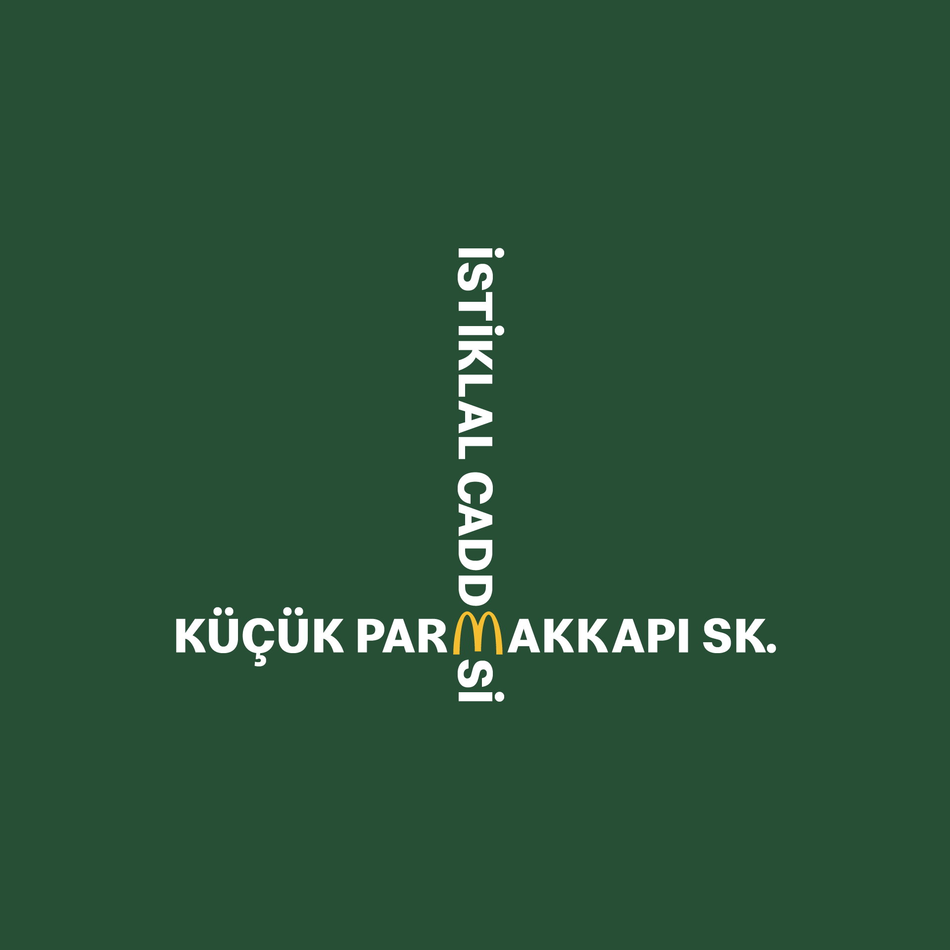
We wanted to solve this with a creative touch: Most McDonald’s restaurants in German cities are located directly in the cross section of busy, well-known streets. With a smart typographical trick of crossing the names of two streets, we mark the exact intersection where the McDonald’s restaurant is located.
We wanted to solve this with a creative touch: Most McDonald’s restaurants in German cities are located directly in the cross section of busy, well-known streets. With a smart typographical trick of crossing the names of two streets, we mark the exact intersection where the McDonald’s restaurant is located.
The Design Idea
McDonald’s world-famous Golden Arch logo is one of the well-designed, minimalist and unique graphic shapes that ever made. As I was checking the logo, suddenly I recognized a nice trick: When you rotate it, it turns into different letters as well: B, W and E. Then, it brought this lovely idea: The Crossroads.
I found the actual locations of McDonalds restaurants on maps, which are directly on the corner and easy-to-connect with each other by this typographic trick.
I found the actual locations of McDonalds restaurants on maps, which are directly on the corner and easy-to-connect with each other by this typographic trick.

Actual location of McDonald’s at
Karl-Marx-Straße x Saalestraße
crossroads on Google Maps


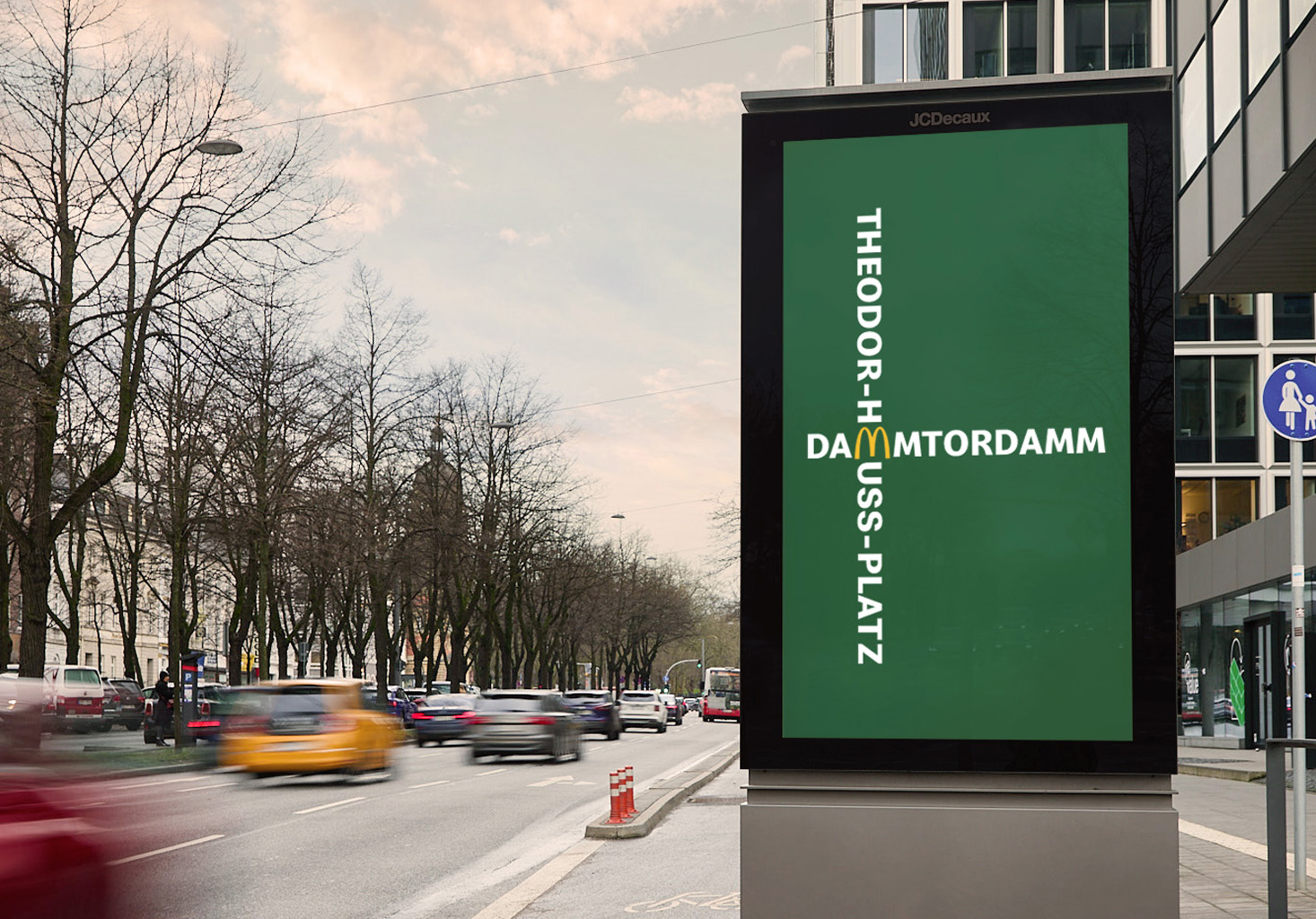

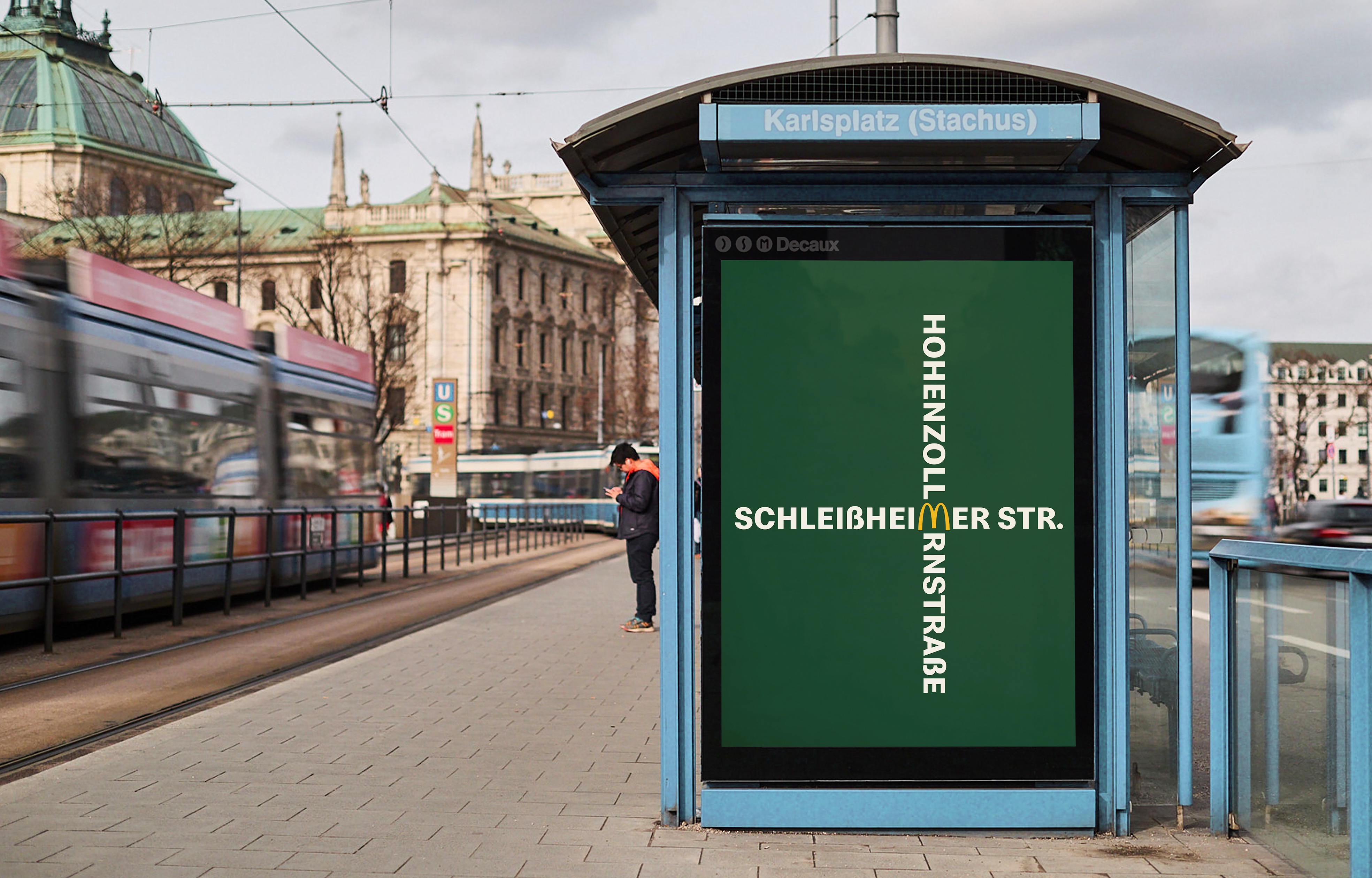


Social Media
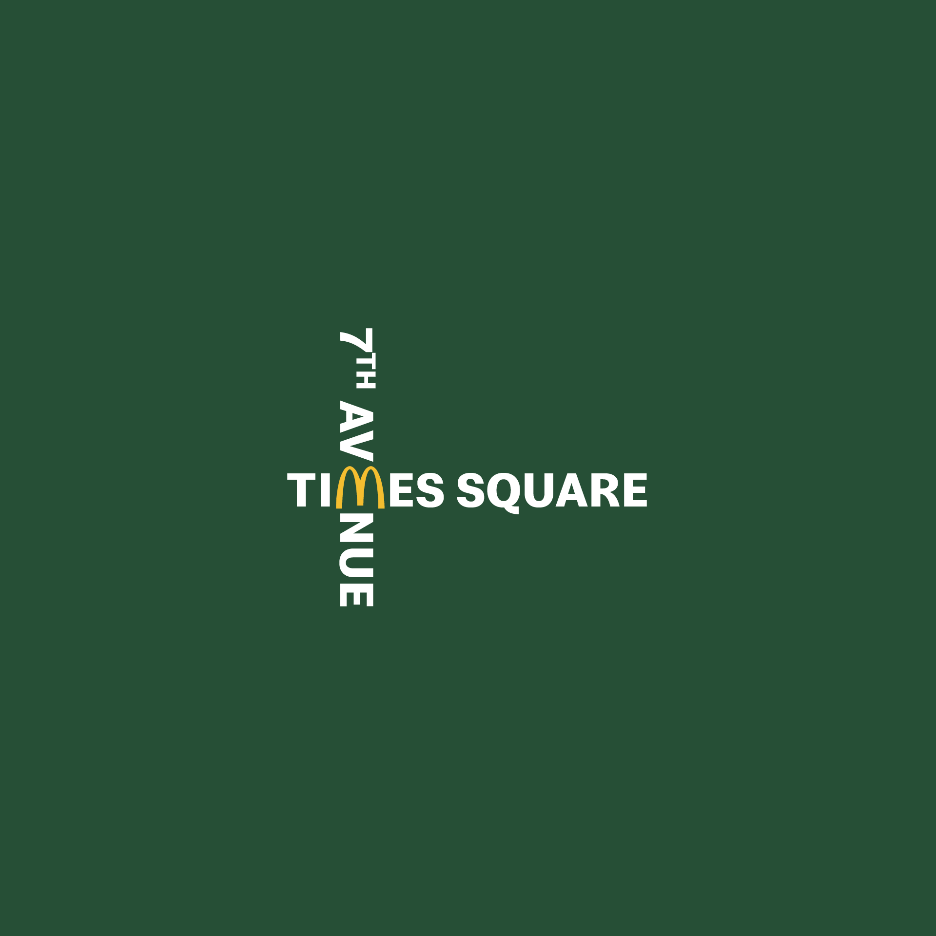
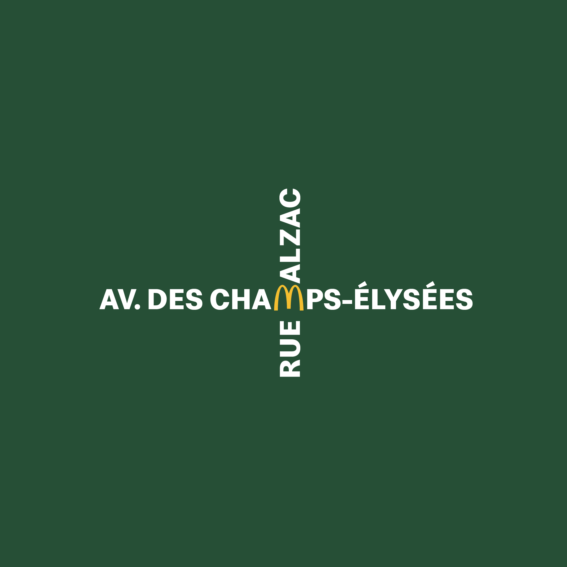
In the next step, I discovered additional McDonald’s restaurants from various parts of the world and developed similar crossroads designs tailored to their locations, demonstrating the adaptability of the concept. Through these posts, we aimed to highlight not only how easily the idea could be implemented across different settings but also its potential for generating a significant creative impact.

Results
The result was a nationwide series of useful and immediately recognizable orientation signs, using only street names and the Golden Arches to show you the way.
A simple, directional system that can be adapted to other markets in the world, using one of the most iconic logo of an iconic restaurant.
A simple, directional system that can be adapted to other markets in the world, using one of the most iconic logo of an iconic restaurant.
Awards
Epica Awards, Restaurants/Bars & Cafés, Silver
ADC Europe Awards, Print & Outdoor, Silver
ADC Europe Awards, Print & Outdoor, Finalist
ADC Deutschland, Print Media, Bronze
New York Festivals, Outdoor/Typography, Finalist
New York Festivals, Outdoor/Best Use, Finalist
New York Festivals, Outdoor/Product & Service, Finalist
New York Festivals, Design/Typography, Shortlist
The One Show, Design, Shortlist
The One Show, OOH, Shortlist
ADC Annual Awards, OOH, Shortlist
Credits
Agency
Scholz & Friends
Creative Director
Jens Petter Waernes
Role
Art Direction, Ideation, Motion Design
© 2024
Scholz & Friends
Creative Director
Jens Petter Waernes
Role
Art Direction, Ideation, Motion Design
© 2024
All Projects